Monstercat Handbook
Bigger, Bolder Document Design

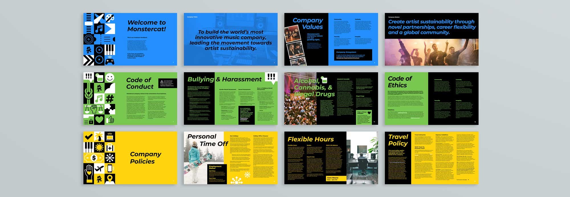
I turned an immense Word document into an energetic and digestible handbook. Employees need to absorb all of the information, but also quickly be able to find relevant information on the fly. With these challenges in mind, I implemented a number of strategies to ensure this potentially dry content was engaging as possible.
-
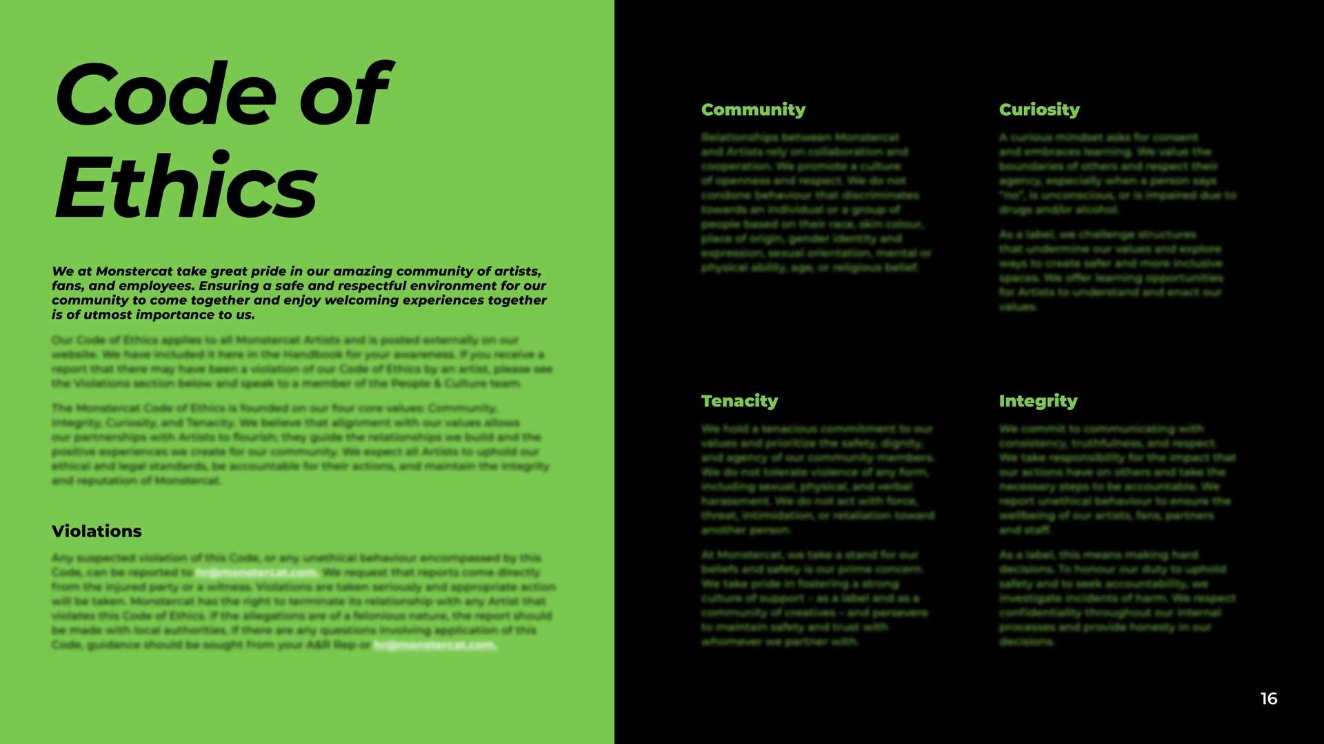
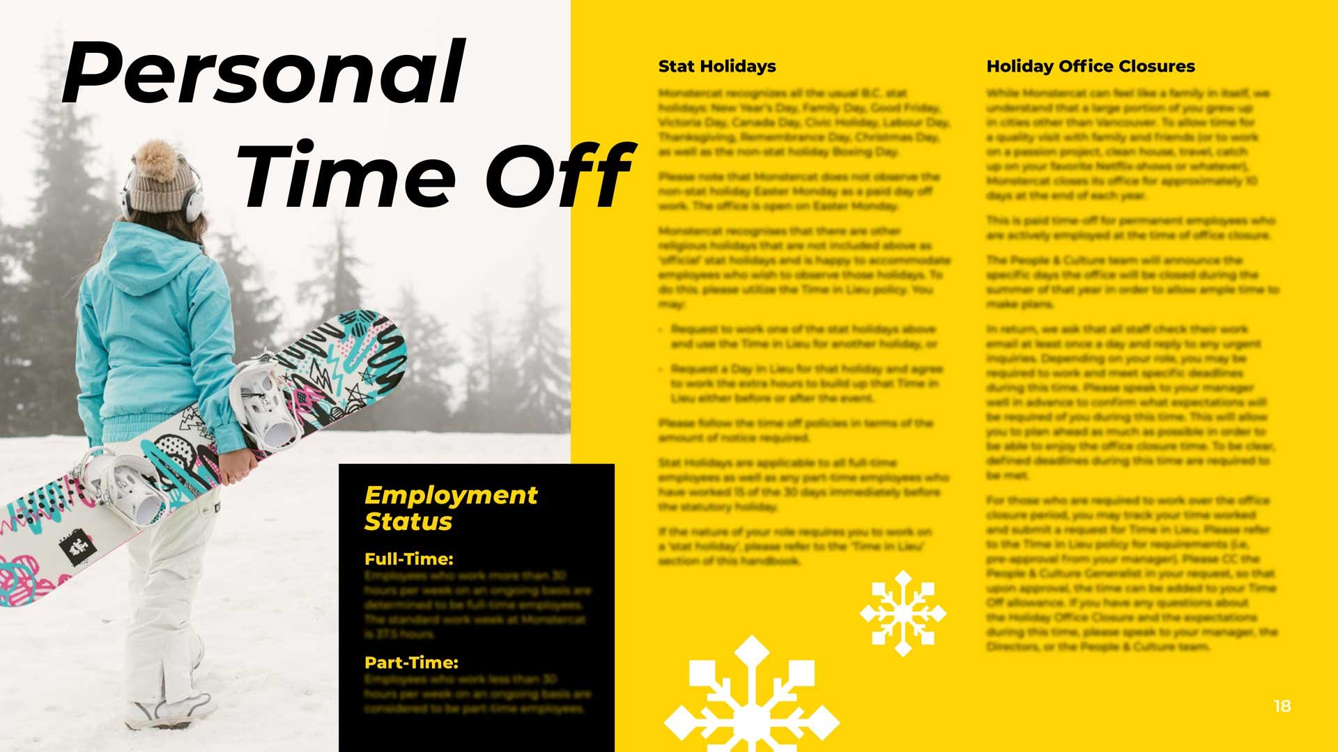
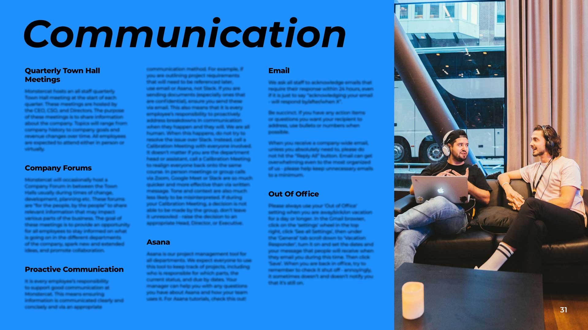
Each chapter is colour-coded, for two reasons. First, to improve navigation and the reader’s ability to skim when necessary. Second, to reduce boredom/fatigue for the reader by adding variety.
-
I designed over 30 icons themed to each chapter of the document. I kept the forms simple, bold – and sometimes a bit cheeky -– to match the tone of Monstercat's logo.
-
Even with the addition of far more visuals than in the original word document, I managed to reduce the page count by nearly ten pages.