Maple Organics Packaging
Adapting a digital-first brand refresh for print

Maple Organics, a Canadian skincare company, invested in a beautiful brand refresh. They were excited to redesign their product packaging next. The catch? The new brand guidelines didn’t account for print. Luckily, I’ve spent countless hours with my nose in Pantone books, so I was up for the challenge!

Extending The Colour Palette
First, I compared the existing colour palette in the brand guidelines to the requirements of the product packaging redesign project. I noticed that the existing palette, while very beautiful, was not comprehensive enough to meet the demands of three redesigned product lines, each targeting different demographics. I identified a need to expand the palette and divide it into two rough categories: deep shades and pastel shades.
For every pre-existing deep shade, I created a matching pastel shade, and vice versa. I thus had a well-rounded, flexible palette I could adapt for print. I took out my uncoated Pantone swatch book and matched each colour to its closest PMS code.
The resulting package designs for two of the three product lines are below (the third is coming soon).


Adaptogens
Maple Organic’s Adaptogens are powdered superfood mixes packaged in eco-friendly resealable pouches and sold in grocery store chains such as Whole Foods.
This product line was the newest and had the broadest target demographics. It needed casual and eye-catching packaging to attract the attention of the average health food store shopper. We also made sure to choose a resealable biodegradable pouch to align with the company’s sustainability initiatives.
Regarding the design, I kept the layout very simple and on-brand. I chose lowercase headings and used pastel gradients to give the packaging that playful and casual first impression we were looking for. The gradient for each product was chosen strategically to evoke the intended effect of its contents: cooler colours were used for “calm” and “sleep,” while warmer colours were used for “energy” and “immunity.”
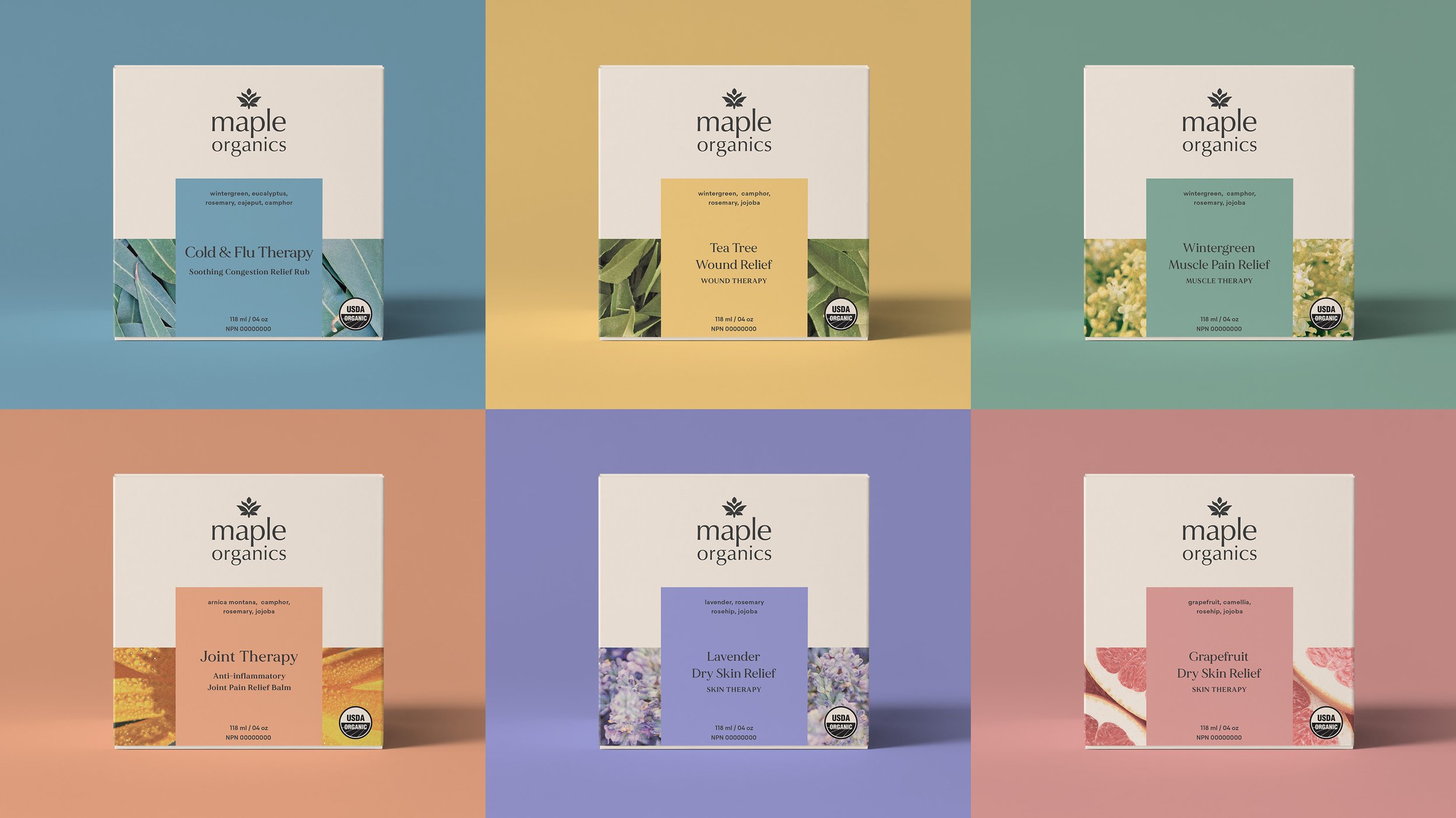

Therapy
Maple Organic’s Therapy line are certified-organic medicinal products sold in the pharmacy section of retailers such as Wholefoods, Well.ca, Healthy Planet, Stong’s Market, Choices Markets, and more.
The packaging needed to look medicinal and command authority. At the same time, package design in the pharmacy section tends to avoid innovation; we were confident we could achieve a more striking design than our competitors.
For the design, I chose the deep swatches over the pastels to convey a more serious tone. I set the logo against the brand’s signature off-white to ensure it was at the very top of the visual hierarchy. With the exception of the USDA organic seal, all other product-specific information is contained in a colour-coded box which wraps around the base of the packaging.
The other challenge was the photography: the company wanted to keep the same photography used on their original product packaging because it would help with brand recognition. In order to properly incorporate the original image, I initially tried grey-scale and monochromatic treatments, but it didn’t have enough visual impact and the full colour photograph prevailed in the end.