S-Tier Apparel Club
Launching a top ranking streetwear visual identity

S-Tier Apparel Club is a members only streetwear club offering exclusive apparel collaborations to the fans of prominent IPs in gaming, anime, manga, comic books and more. I created a bold visual identity, surface patterns, and a variety of merchandise designs for the club’s official launch.
The visuals of S-Tier Apparel Club evoke feelings of nostalgia, taking inspiration from early video games, comic books, and manga. As a company that values quality and exclusivity, it was important to balance this playful nostalgia with an overall sleek, premium aesthetic. The typography and color palette have been designed with enough flexibility to either stand out or to stay in the background when it’s time for the products to shine.


Logos
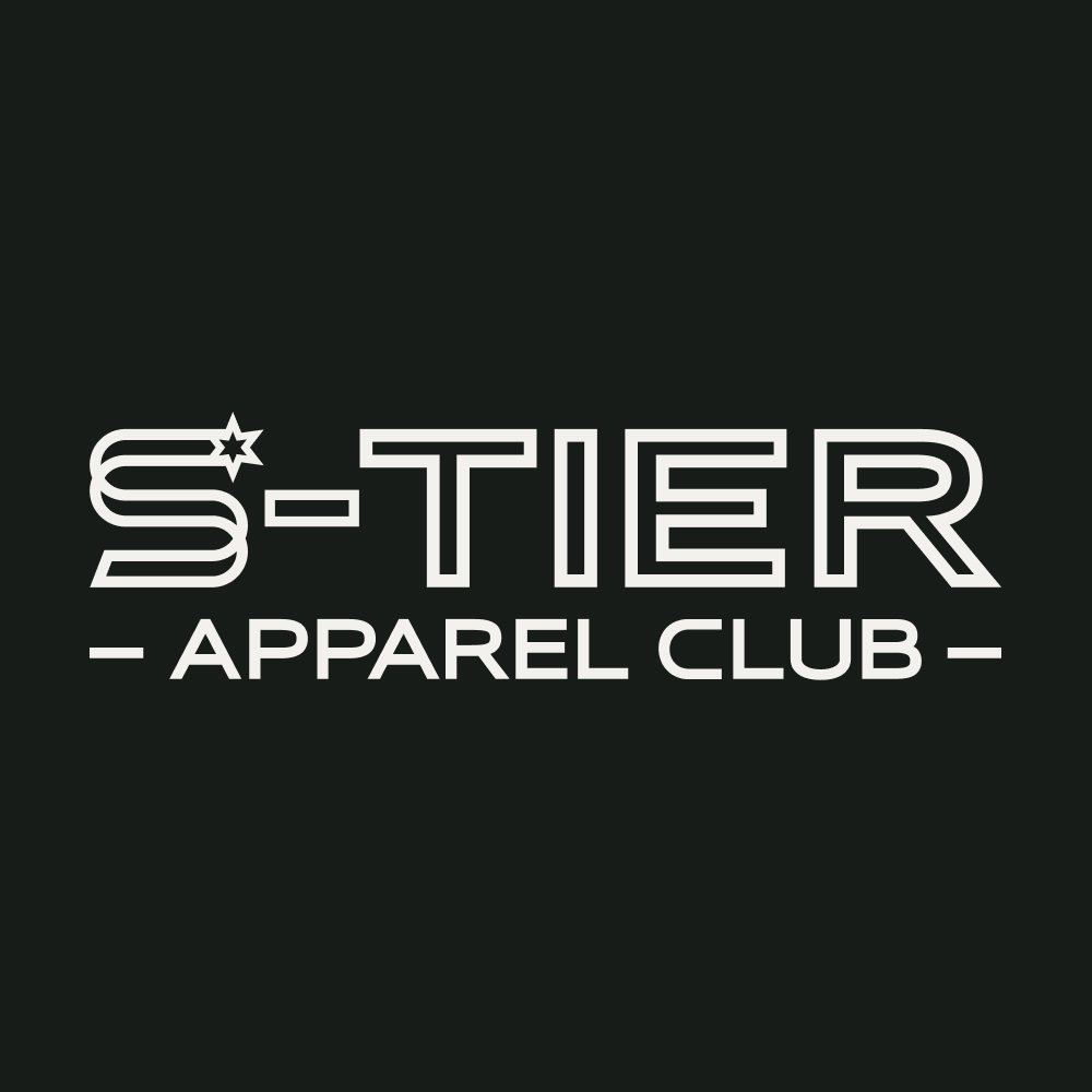
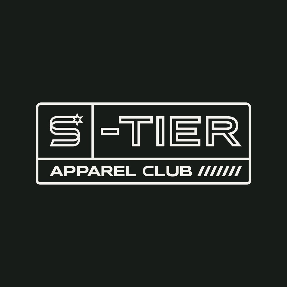
For apparel companies, especially ones with monthly releases, flexibility and variety are king. The logo doesn’t simply sit in their website header and in the corner of their documentation, it’s also part of their apparel design ecosystem: it has to work as a laser cut patch, a screen print, an embroidered chenille patch, flocking, embossing, and more. Ensuring every shape present in the logo was large enough to allow for all of these future applications was a priority.
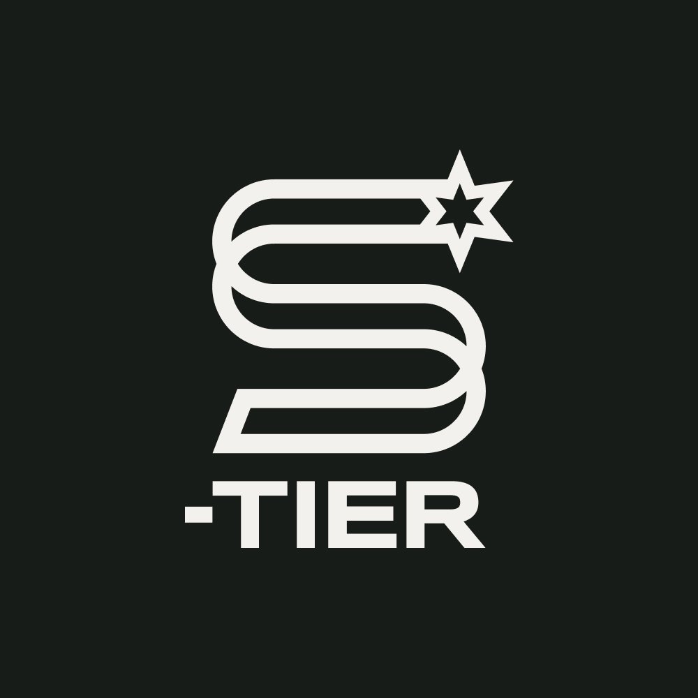
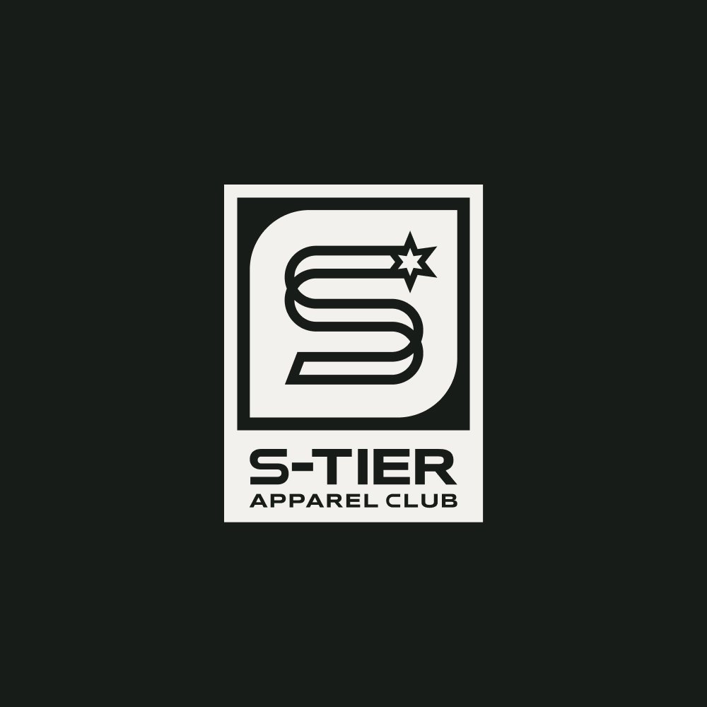
I focused on designing the “S” monogram lettermark first: if I couldn’t imagine a streetwear fanatic selling an “iconic” S-Tier monogrammed jacket on the secondary market twenty years from now, my job wasn’t done. It was critical to capture the euphoria of achieving “S-Rank” or “S-Tier” in a video game, joining an exclusive club of the very best players. The “S” itself represents a shooting star with it’s tail curling in on itself to form the contours of the letter. I kept the linework bold and geometry simple, inspired by the early logos of entertainment and technology giants like Sega, Sony, Namco, and Nintendo.
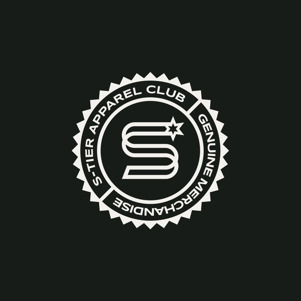
I also created a suite of secondary logos to used primarily in apparel design, or as a supplement to the core brand assets in editorial design. This includes the “Seal of Authenticity”, used to communicate the items are officially branded products, instilling trust between the company and its customers.

Colour
Brand Palette: Soft, slightly warm shades of black and white are at the core of the brand palette. Console Grey, as the name suggests, is inspired by the plastic cases of early video game consoles and cartridges. Finally, a bright golden yellow evokes the feeling of earning those elusive golden stars in your favourite game.
Extended Palette: The extended palette is designed to complement the Brand Palette, adding variety to advertisements, illustrations, apparel collections, and more. These shades are directly inspired by the bright colours of early video and arcade games and their packaging.


Type
Clash Grotesk Display and Clash Grotesk are used for headings and body text respectively. A variable neo-grotesk font family, Clash is classic and flexible enough for everyday use. Its increased character width and the contrast between strokes give it a slightly futuristic personality in context.
Press Start 2P, a font inspired by 1980s arcade games, is used with restraint to provide an additional hit of nostalgia.

